


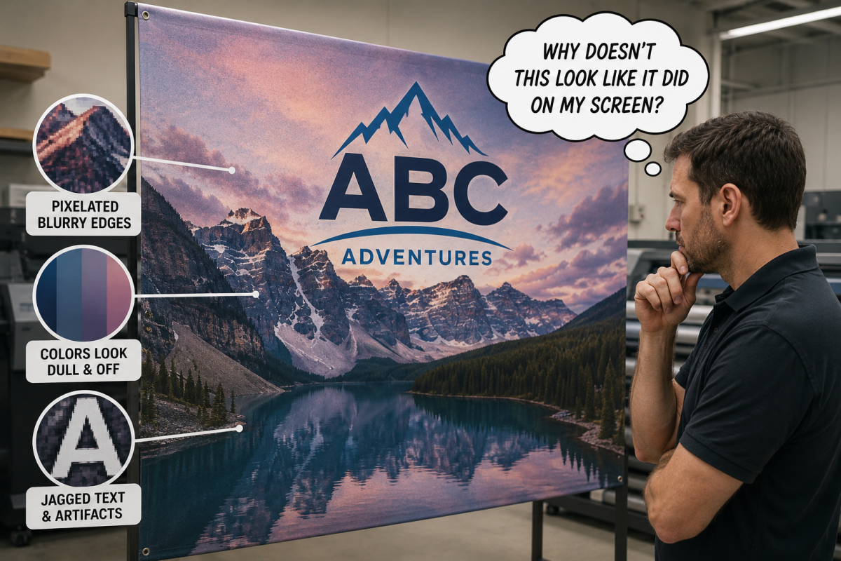
What Happens When AI Artwork Meets a 10-Foot Trade Show Banner
We’ve noticed a pattern over the last few months: more clients are showing up with a design already in hand — a logo concept, a booth backdrop idea, a full mockup — generated by ChatGPT(opens in new tab), Midjourney(opens in new tab), or another AI tool. We think that’s a genuinely good development. It means clients are walking in with a clearer vision instead of a blank page, and that makes the whole project move faster.
It also means we’re having the same conversation more often: the file that looked incredible on a phone screen needs some work before it’s ready for a 10-foot banner, a vehicle wrap, or a storefront sign.
We want to be upfront about something: this isn’t us gatekeeping “real” design from AI-assisted design. Every file we print — hand-designed or AI-generated — goes through the same review before it hits production. AI artwork just tends to trip the same few wires more often, so here’s exactly what those are, why they happen, and how we fix them.
Your screen is lying to you (a little)
Not on purpose. A phone or laptop screen is small, backlit, and dense with pixels. A trade show backdrop or vehicle panel is large, reflective, and viewed from a completely different distance. A design can look flawless in one context and fall apart in the other, and there’s no way to catch that difference until you know what to look for.
Here’s the math that makes it concrete. Most AI tools generate images around 1024–2048 pixels wide — plenty of detail for a monitor. Many print products are designed at 300 DPI at final size, although large format graphics intended to be viewed from farther away are often produced at lower effective resolutions. A 3-foot-wide banner printed at 300 DPI needs roughly 10,800 pixels of width. That’s five to ten times more detail than most AI tools hand you by default. That gap is exactly where blur, softness, and “stair-stepping” on curves and diagonals come from.
The good news: viewing distance buys you some room. A large banner or backdrop viewed from ten feet back can often work at 150 DPI instead of 300 — which is part of why our own resolution guidelines scale down as projects get bigger. But that forgiveness only applies to distance-viewed pieces. A vehicle wrap, a storefront sign, or anything with text people will read up close doesn’t get that same break.
Two comparisons worth understanding
RGB vs. CMYK. Screens display color as RGB — glowing red, green, and blue light, which is why AI-generated images can carry electric neons and saturated tones that look incredible on a monitor. Printing uses CMYK or spot ink, a narrower range of color. Bright blues and purples are the most common casualties — they can shift or go slightly muddy in the conversion if nobody catches it first. If a color is core to your brand, that’s worth flagging to us before production, not after.
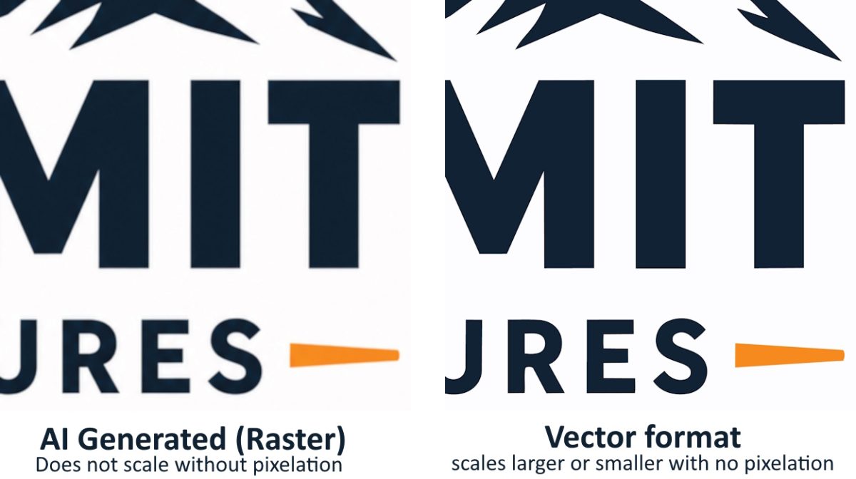
Vector vs. raster. Most AI image generators produce raster files rather than true vector artwork — flat grids of pixels with a fixed resolution. Enlarge a raster file past its native size and it degrades. Vector files (the AI, EPS, or PDF formats used for logos and clean typography) are built from math, not pixels, so they scale to any size with zero quality loss. This matters because AI tools don’t generate true vector art — so a logo pulled from an AI image, however clean it looks, is still a raster file underneath, with a size ceiling. If that logo needs to work on a banner and a business card, it usually needs a proper vector rebuild.
The issues we see most often — and how to spot them yourself
| Issue | What it looks like | Why it happens | How to catch it early |
| Blur / pixelation | Soft edges, or visible squares and stair-stepping on curves | Not enough resolution for the final print size | Zoom to 100% before sending — if it’s soft at 100%, it’ll be soft on the wall |
| Distorted logos or garbled text | A logo that’s almost right but slightly warped; letters that look real but aren’t | AI still struggles most with exact brand marks and true typography | Compare against your actual logo file side by side, not from memory |
| Artifacts | Odd textures, smudges, small inconsistencies in detail | Leftover quirks from how the image was generated | Inspect at full resolution, not thumbnail size |
| Color shift | Colors look duller or “off” once converted for print | RGB-to-CMYK conversion narrows the color range | Flag any brand-critical color before we start production |
| Composition problems | Cropped or awkward layouts, important elements pushed to the edge | Square AI output forced into a rectangular banner, wrap, or backdrop | Mock the design up at actual print dimensions early, not after it’s “final” |
Where AI art earns its keep — and where it needs backup
What is solid on its own or with light cleanup:
- abstract backgrounds
- textures
- mood boards
- concept direction — especially for large-format pieces viewed from a few feet back, like backdrops and tension fabric displays.
What needs our team before it goes to press:
- anything with your logo in it
- text-heavy layouts
- vehicle wraps and storefront signage that get viewed up close
- anything that has to match your brand color exactly.
If it has to be perfect, treat AI as the sketch, not the final file.
How we handle it
None of the issues above mean starting over. Most are a straightforward fix once we know they’re there:
- We review your file against the actual product — a vehicle wrap, a trade show backdrop, and interior signage each have their own resolution and layout requirements.
- We tell you exactly what it needs, in plain language, before anything goes into production.
- We fix what we can in-house — resolution, color, and layout adjustments are things our design team handles routinely. A logo that needs a clean vector rebuild is the one thing that sometimes needs to come from your original source files.
You’ll see a proof before anything prints, so there’s no reprint surprise waiting at the other end.
The short version
- AI artwork is a great way to get a concept moving — bring it to us.
- Screen-ready and print-ready are not the same thing, especially at large-format sizes.
- The gap usually shows up as resolution, color shift, wrong proportions, logo/text distortion, or artifacts.
- We review every file before production and tell you exactly what it needs — no surprise costs, no last-minute scramble.
Our full technical specs — accepted file formats, resolution by project size, and color matching guidelines — are on our Preparing Artwork for Print page. For more on how we handle AI-generated files specifically, see AI Artwork for Print.
Have a concept ready to go? Upload your file and we’ll tell you exactly where it stands before anything goes to print.